Features
Analytics
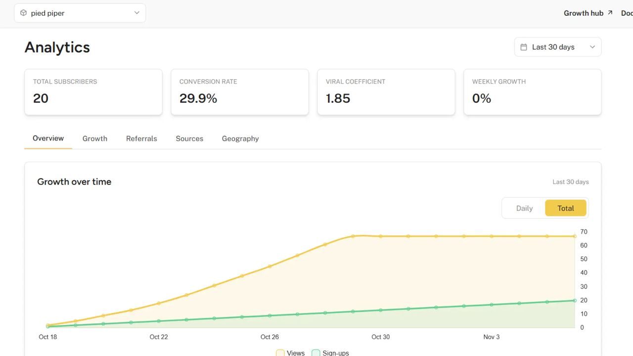
The analytics dashboard provides insights into your waitlist's performance through real-time metrics and visual charts. This powerful tool helps you understand your audience, track growth, and optimize your waitlist strategy.
Access to the analytics dashboard requires the Growth plan.
Performance Overview Cards
At the top of your dashboard, you'll find three cards that provide at-a-glance metrics of your most important KPIs.
Subscribers Stats
The Subscribers card gives you a complete picture of your waitlist growth.
- Total: The overall number of subscribers who have joined your waitlist
- Verified: Number of subscribers with verified email addresses
- Today: Today's sign-ups with a percentage comparison to yesterday
- This Week: Sign-ups over the past 7 days with a comparison to the previous week
The comparison indicators show performance trends using green (increase) or red (decrease) badges with percentage changes.
Views Stats
The Views card tracks engagement with your waitlist.
- Total: Cumulative view count across all your waitlist touchpoints
- Today: Today's views with a percentage comparison to yesterday
- This Week: Views over the past 7 days with a comparison to the previous week
Analyzing views alongside subscribers helps you understand your overall reach and audience engagement.
Conversion Stats
The Conversion card shows how effectively you're turning visitors into subscribers.
- All Time: Your overall conversion rate (sign-ups divided by views)
- This Week: Conversion rate for the past 7 days with a comparison to the previous week
This metric is crucial for understanding how compelling your waitlist offering is to potential subscribers.
Visual Analytics
The charts section provides deeper insights into your audience and referral performance through easy-to-understand visualizations.
Geographic Distribution
The "Subscribers by countries" pie chart shows where your audience is located.
- Color-coded segments for each country
- Percentage breakdown of your subscriber base by location
- "Other" category (in gray) for countries with fewer subscribers
This helps you understand your global reach and where your audience is concentrated.
Referral Analysis
The "Subscribers by referrals" pie chart shows the effectiveness of your referral program.
- Breakdown between subscribers who came through referrals vs. direct sign-ups
- Percentage distribution to easily assess your referral program's impact
- Color-coded for quick visual assessment
This chart helps you gauge how much of your growth is organic versus referral-driven.
Top Referrers
The "Top 5 referrers" bar chart highlights your most valuable ambassadors.
- Ranked list of your most successful referrers
- Number of people each person has referred
- Color-coded bars for easy comparison
- Dynamically adjusts height based on the number of top referrers
This chart helps you identify your most engaged subscribers who are actively promoting your waitlist.
Traffic Sources
The "Referring domains" bar chart provides insights into where your traffic is coming from.
- Side-by-side comparison of views (gold) and sign-ups (green) from each source
- Helps identify which traffic sources convert best
- Includes direct traffic and various referral sources
- Legend to distinguish between views and sign-ups
This visualization is particularly valuable for understanding which channels are most effective at driving quality traffic to your waitlist.
Interpreting Your Analytics
Here's how to get the most out of your analytics dashboard.
Growth Trends
- Compare today's and this week's metrics to spot short-term trends
- Look for consistency between views and sign-ups—if views are up but sign-ups aren't, you may need to optimize your landing page
Geographic Insights
- High concentration in specific countries may indicate where your product resonates most
- Consider tailoring messaging or features based on regional interest
- Identify opportunities to expand into underrepresented regions
Referral Program Effectiveness
- A healthy referral percentage (~30%+) indicates your referral program is working
- If referrals are low, consider improving your referral incentives or making the sharing process easier
- Identify and potentially reward your top referrers to encourage continued promotion
Channel Optimization
- Focus resources on referring domains with high conversion rates
- Investigate sources with many views but few sign-ups to identify conversion barriers
- Use these insights to guide your marketing and promotion strategies
Using Analytics for Decision-Making
The analytics dashboard helps you make data-driven decisions.
- Set realistic goals: Use current performance as a baseline for future targets
- Optimize conversion: Identify and address bottlenecks in your waitlist funnel
- Target marketing efforts: Focus on channels and regions showing the most promise
- Improve referral program: Adjust incentives based on referral performance
- Track growth over time: Monitor how changes to your waitlist affect key metrics