25+ Coming Soon Page Examples That Convert (2026 Edition)

Harry's did it. 100,000 email signups in just seven days with a simple coming soon page.
Robinhood topped that. Their pre-launch page generated a waitlist of 1 million people before they processed a single stock trade. The buzz was so intense it helped them secure $13 million in funding.
These aren't lucky flukes. They're examples of what happens when you build a coming soon page that actually works.
Most founders treat coming soon pages like digital "closed for business" signs. They slap together a logo, add "launching soon" in generic font, throw in an email box, and call it done. Then they wonder why their waitlist stays empty.
The difference between a page that generates 100 signups and one that generates 100,000 comes down to psychology, design, and strategy. The companies that nail their pre-launch pages understand something critical: your coming soon page isn't just a placeholder. It's your first impression, your lead generation engine, and your validation tool rolled into one.
In this guide, you'll see 25+ real examples of coming soon pages that actually converted. We'll break down exactly what makes each one work, the psychology behind the design choices, and how you can adapt these strategies for your own product launch.
What Is a Coming Soon Page?
A coming soon page is a single web page that announces a product, store, or website before it launches and collects visitor emails for a waitlist. Instead of an empty "under construction" placeholder, it does one job: turn early interest into signups you can market to at launch. The pages that convert pair a benefit-led headline, one email field, and a touch of social proof.
Why a Pre-Launch Page Earns Its Keep
Before we dive into examples, let's establish why getting this right matters more than you think.
They capture demand before it evaporates. Someone discovers your product through a social media post or friend recommendation. Without a landing page to capture their interest, they forget about you within minutes. A coming soon page transforms curiosity into a waitlist signup.
They provide validation without building the full product. Before investing months into development, you need to know if people actually want what you're building. Email signups on your coming soon page, especially from cold traffic, are one of the strongest signals of genuine interest.
They create urgency and exclusivity. Humans are wired to want what others want and what feels scarce. Research shows that 60% of people make purchases because of FOMO (fear of missing out), mostly within 24 hours. A well-designed coming soon page with waitlist signup makes people feel like they're getting early access to something valuable, not just another newsletter subscription.
They enable viral growth through referrals. The best coming soon pages include referral mechanics that turn early subscribers into active promoters. Every person who joins becomes a potential marketing channel. Dropbox grew 3900% using this exact strategy.
They keep you top-of-mind until launch. The average person sees thousands of marketing messages daily. Without capturing their email, you've lost them. With it, you can nurture the relationship through updates, behind-the-scenes content, and anticipation-building campaigns.
What Makes These Pages Convert: 7 Core Elements
Before you look at the examples, understand what elements consistently drive conversions.
A Headline That Instantly Communicates Value
Your headline isn't about you. It's about the problem you solve or the benefit you deliver. Robinhood's "Commission-free trading" headline immediately communicated their revolutionary value proposition, while generic phrases like "Something amazing is coming" mean nothing.
Test your headline by asking: Can someone who's never heard of your product understand what you do within five seconds? If not, rewrite it.
A Clear, Compelling Value Proposition
After the headline, you need 1-2 sentences that explain why someone should care. This isn't about features. It's about transformation. What changes for your user when they get access to your product?
An Impossibly Simple Signup Form
Every field you add to your form reduces conversion rates. According to landing page optimization research, reducing form fields can significantly boost conversions. Email only? Perfect. Email + name? Acceptable if you need it for personalization. Anything beyond that? You're losing signups.
The most successful pages make joining feel effortless. One field, one button, done.
Visual Elements That Build Credibility
High-quality images, product mockups, or demo videos help make your concept feel real and tangible. For SaaS products, showing your actual interface builds trust. For physical products, professional photography makes people imagine owning it.
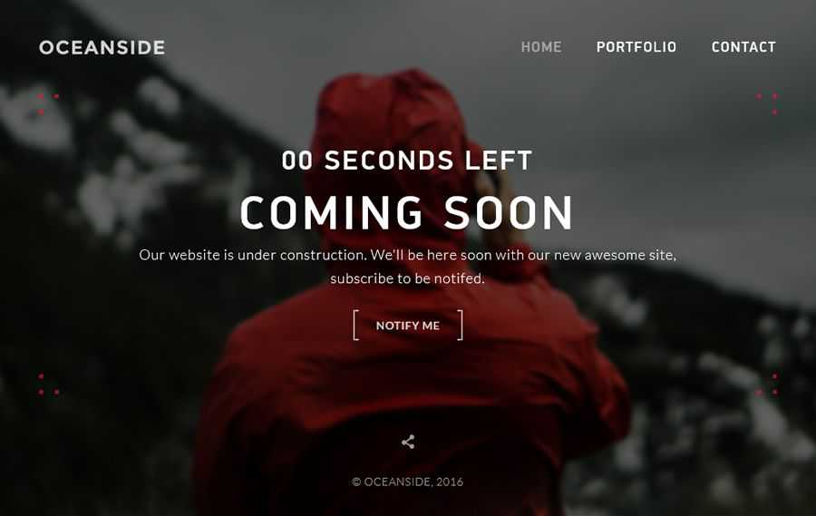
A Countdown Timer (When Appropriate)
Countdown timers create urgency and give visitors a clear timeline, making the launch feel concrete rather than perpetually "coming soon." However, only use them if you have a real launch date. A fake countdown destroys credibility.
Social Proof Indicators
Studies show that displaying social proof can increase conversion rates by up to 270%. Showing how many people have already signed up, featuring testimonials from beta users, or displaying logos of companies using your product in beta all leverage social proof psychology. When people see others are interested, they become more interested themselves.
Referral Incentives
The pages that go viral include reward systems for sharing. This doesn't have to be complex. Even a simple "skip the line" mechanic like Robinhood used can create powerful motivation to share.
Examples by Platform
Now let's look at real, actionable examples organized by the platform you might use to build your coming soon page. Each platform has different strengths, and seeing examples helps you visualize what's possible.
Building with Waitlister
Waitlister is specifically designed for product launches, with everything you need built in: drag-and-drop landing page builder, email capture, referral programs, and analytics.
Example 1: SaaS Product Launch
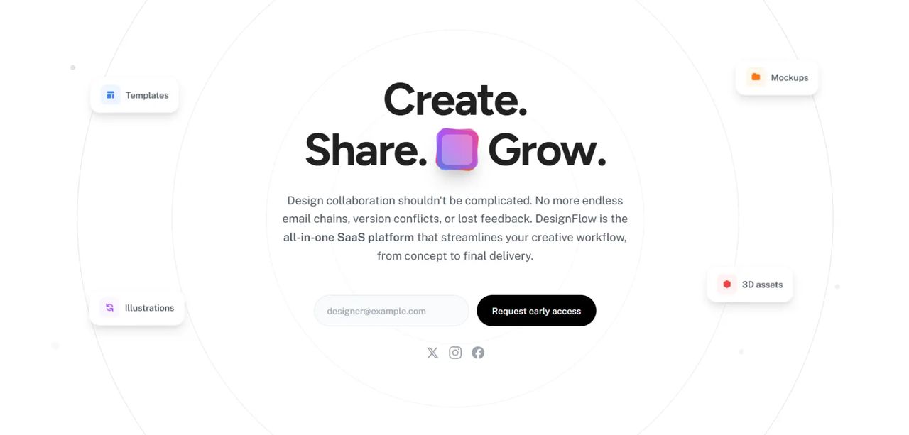
Clean, modern design featuring 3D elements and floating UI components. The page leads with a bold, centered headline paired with a purple 3D icon. A detailed value proposition paragraph explains product benefits clearly, followed by a simple email input with a prominent CTA button.
The floating UI cards showcase key features (Templates, Illustrations, Mockups, 3D assets) without overwhelming visitors. Three social media icons enable multi-channel engagement.
What Makes It Work: The design creates visual interest without distraction. The 3D icon adds personality while the floating elements showcase product value immediately.
Example 2: Mobile App Preview
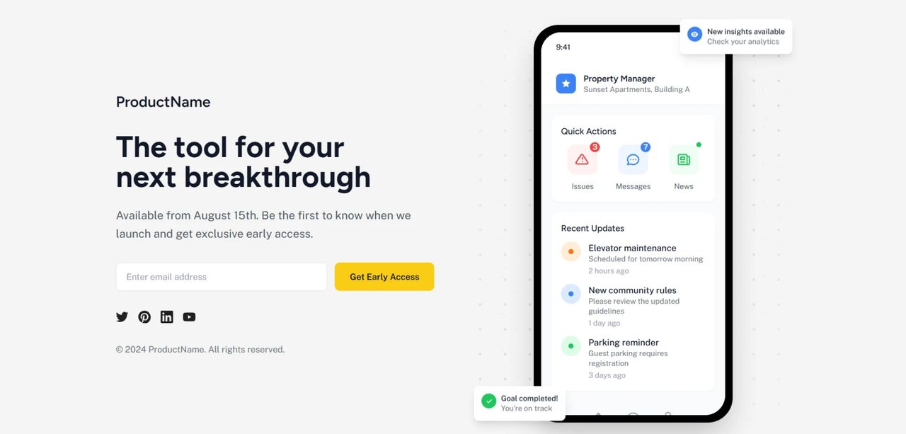
This split-screen layout maximizes space—content on the left, product mockup on the right. A clear launch date ("Available from August 15th") sets concrete expectations.
The phone mockup showing the actual app interface builds trust and desire. Visitors can visualize themselves using the product before it launches.
What Makes It Work: Showing the real interface removes uncertainty. People aren't signing up for an abstract concept—they're seeing exactly what they'll get.
Example 3: Premium Dark Theme
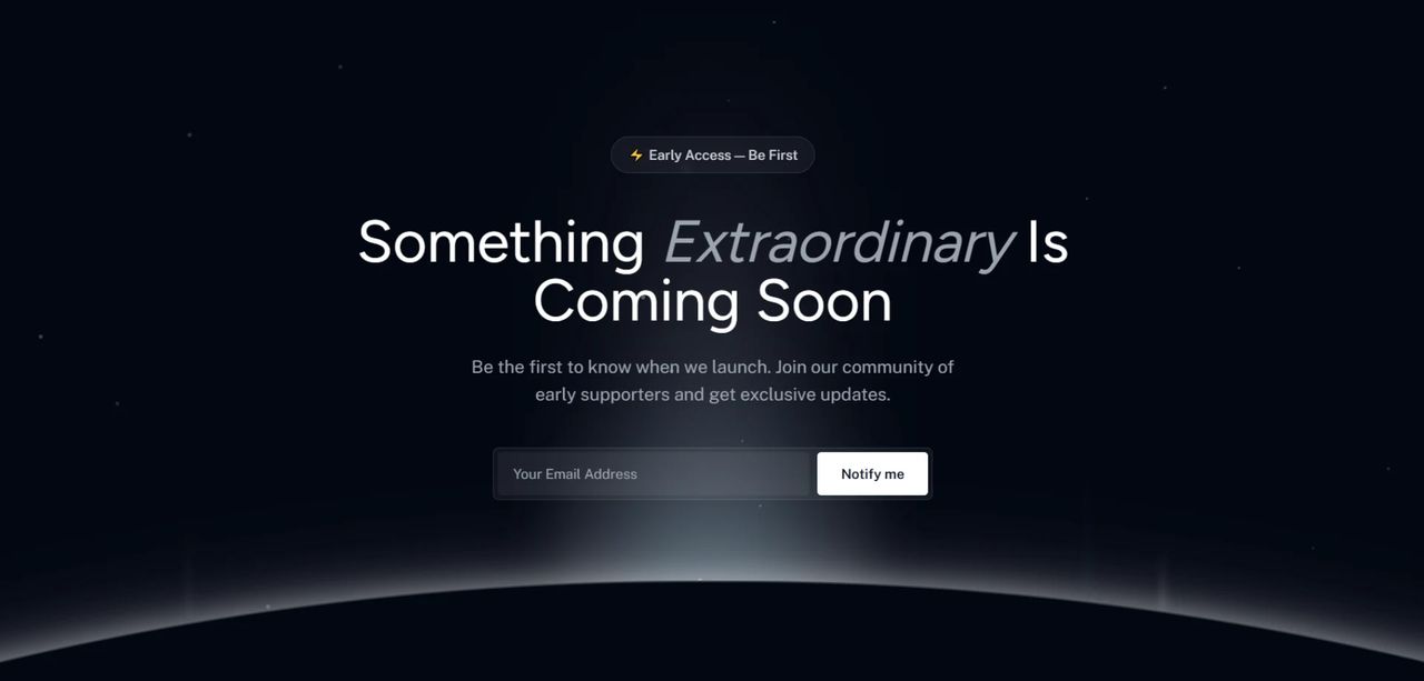
Dramatic space-themed design with a stunning dark background featuring stars creates a premium, mysterious aesthetic. The lightning bolt badge "⚡ Early Access — Be First" creates FOMO at the top.
A spotlight effect draws the eye to the signup area, while the headline with italic emphasis ("Something Extraordinary Is Coming Soon") builds anticipation.
What Makes It Work: The premium aesthetic immediately positions the product as high-value. The dark theme with spotlight creates dramatic visual hierarchy.
See the complete Waitlister setup guide →
Building with Shopify
For ecommerce businesses launching new products or stores on Shopify, coming soon pages need to balance product presentation with email capture.
Example 1: Limited Edition Product Drop
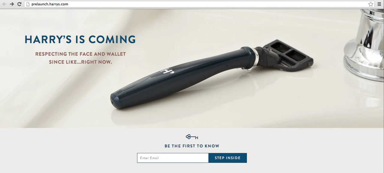
Harry's razor launch page is the gold standard. Large hero product image on clean white background builds desire. Witty subhead ("RESPECTING THE FACE AND WALLET SINCE LIKE...RIGHT NOW.") establishes brand voice.
Simple email input with navy "STEP INSIDE" button keeps focus on conversion. The key icon with "BE THE FIRST TO KNOW" provides clear value.
What Makes It Work: The product hero shot creates desire while the minimal design keeps friction low. The copy is memorable and shareable.
Example 2: New Store Launch
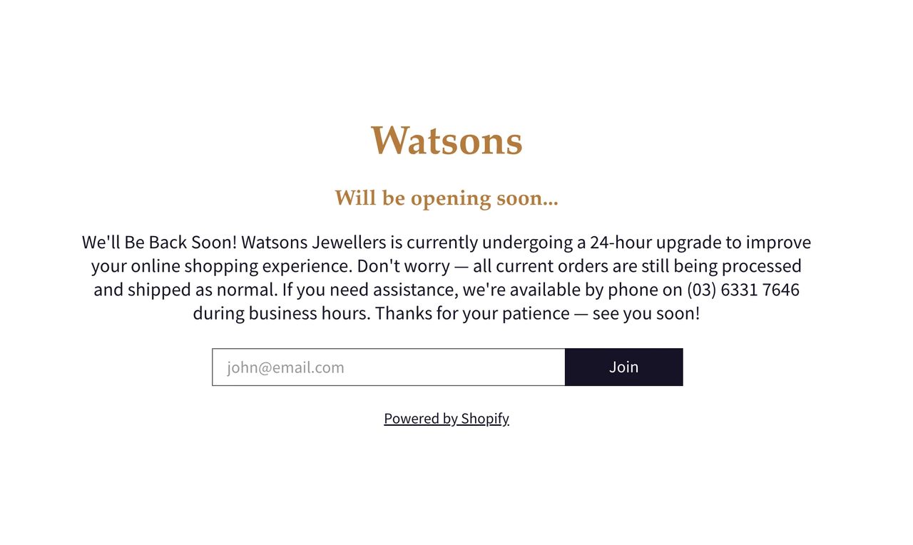
Ultra-minimal maintenance page with elegant serif typography in gold/bronze creates a premium feel. "Watsons" branding with "Will be opening soon..." sets expectations clearly.
The detailed explanation paragraph maintains transparency and trust. Contact phone number provided ensures customer service continuity during the transition.
What Makes It Work: Transparency builds trust. Visitors understand what's happening and when to expect the launch, reducing frustration.
Example 3: Collection Pre-Order Page
For specific product collections, Shopify enables detailed coming soon pages with countdown timers, product category selection, and pre-order capabilities.
Countdown timers create urgency for limited releases. Category-specific signup ensures customers only get updates relevant to their interests.
What Makes It Work: Segmentation prevents email fatigue. Customers choose exactly what they want to hear about, increasing engagement rates.
See complete Shopify coming soon guide →
Building with Carrd
Carrd is perfect for ultra-fast, single-page coming soon sites. The platform's simplicity forces focus on essential elements.
Example 1: Minimalist SaaS Launch
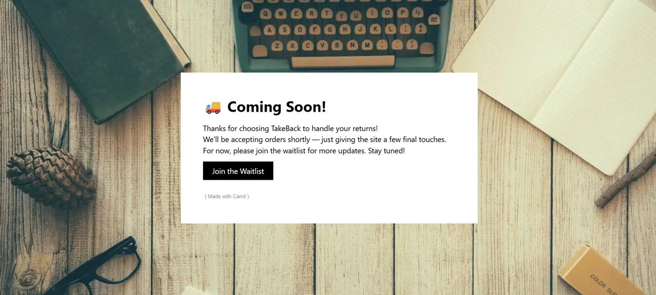
Ultra-clean design proving less is more. Simple white card overlay on warm background with focused messaging. Centered design creates instant focus, with a friendly emoji (🚚) adding personality to the headline. Single clear black CTA button: "Join the Waitlist."
What works: The white card creates perfect contrast. Three lines of copy explain the service and timeline in plain language, nothing more.
Example 2: Product Teaser Style
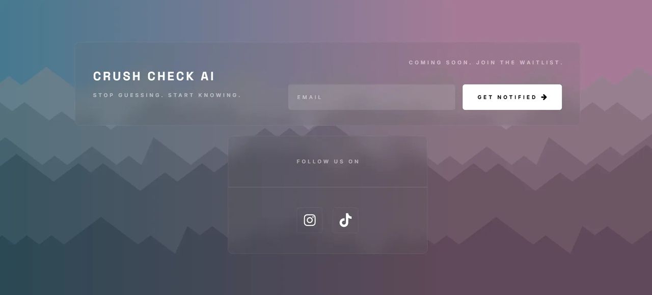
Modern gradient design (teal to pink) creates premium feel. Bold white brand name ensures recall, with benefit-driven tagline addressing the pain point. Transparent email input with prominent white "GET NOTIFIED" button.
What works: The gradient background is bold without being distracting. The "COMING SOON. JOIN THE WAITLIST." text in the top right sets immediate expectations.
Example 3: Newsletter-Style Launch
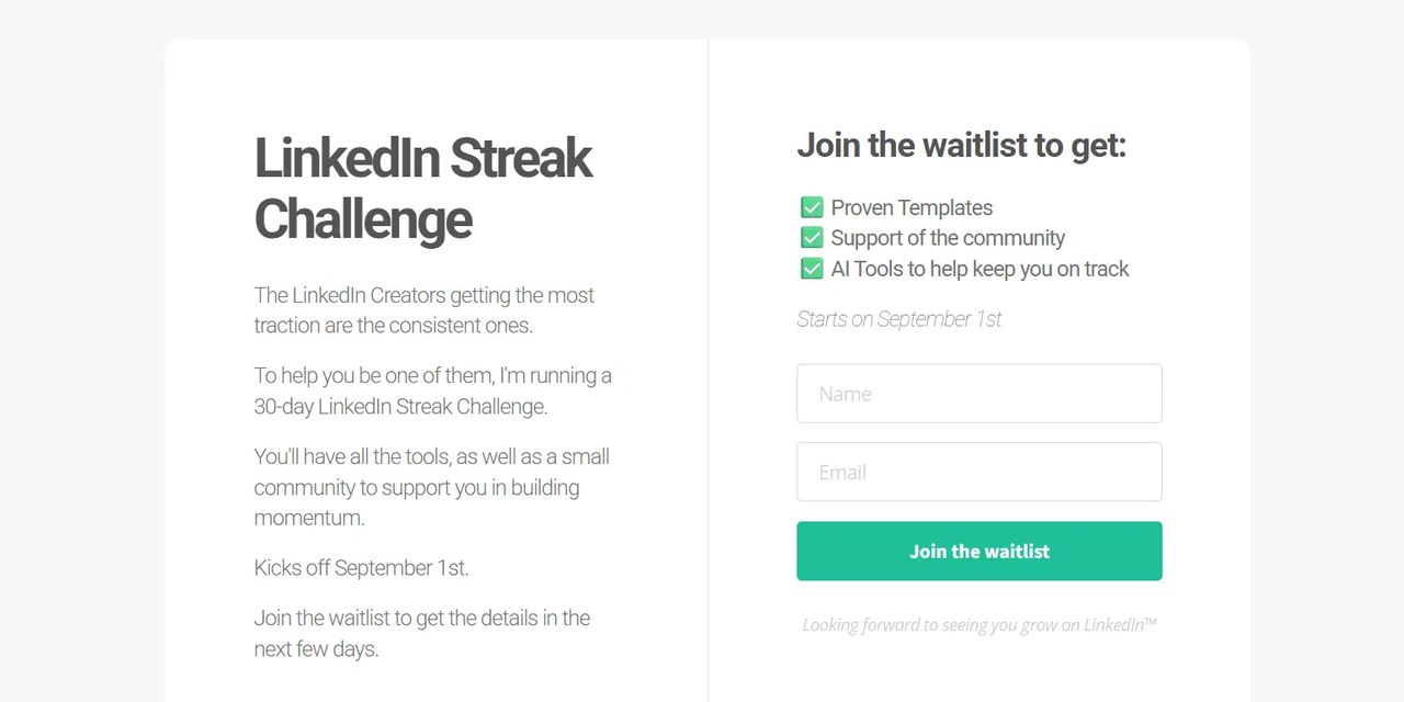
Two-column split layout educates before asking. Left side tells the story, right side captures leads. Problem-solution framing explains why consistency matters on LinkedIn. Clear launch date ("Starts on September 1st") sets concrete expectations. Benefit-focused checklist with green checkmarks shows what subscribers get.
What works: Perfect for community-driven launches where context matters. The split-screen lets you educate without overwhelming.
Best Use Cases:
- Solo entrepreneurs testing ideas quickly
- Side projects needing minimal setup
- Events and launches with single focus
- Portfolio teasers for creatives
Pro tip: Use Carrd for speed but integrate with a proper email marketing platform via webhook or Zapier for follow-up campaigns.
See complete Carrd setup guide →
Building with Framer
Framer combines design flexibility with interactive animations, perfect for creative products or design-forward brands.
Example 1: Product-First SaaS Launch
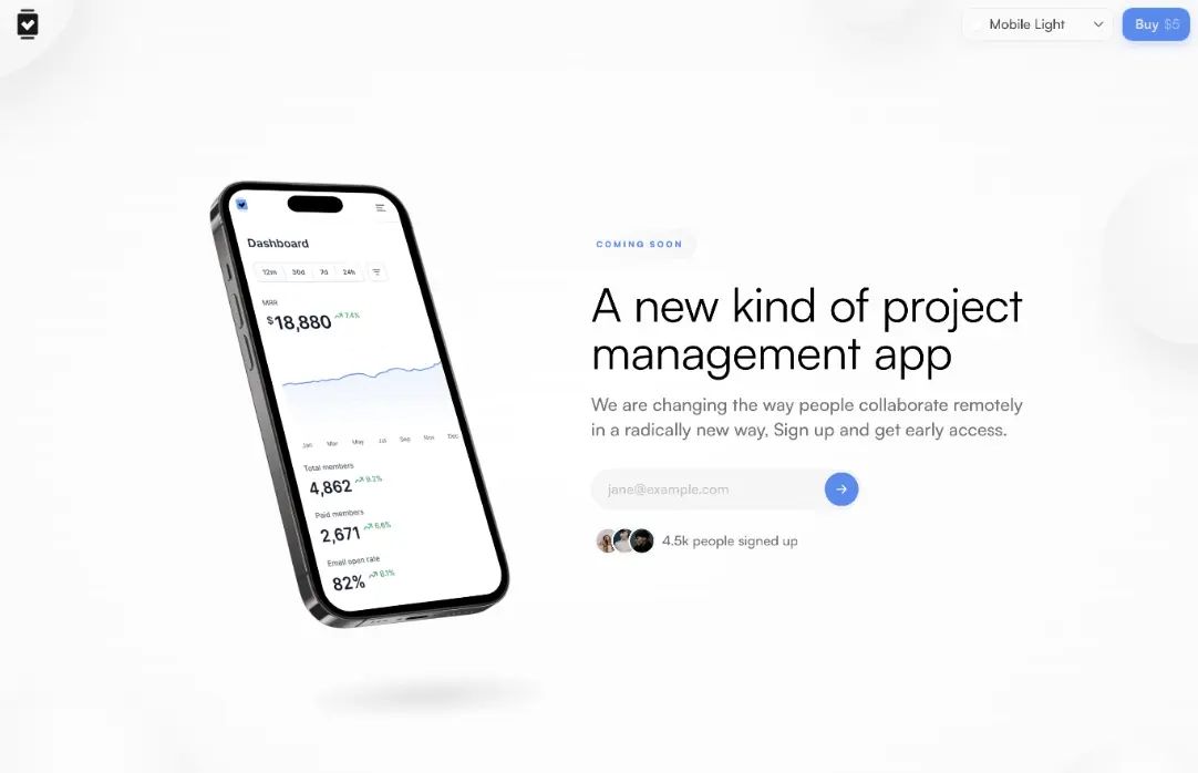
Clean page showcasing the product through a 3D phone mockup alongside simple email capture. Benefit-driven headline ("A new kind of project management app") immediately communicates value. Product mockup showing actual dashboard interface builds credibility. Strong social proof: "4.5k people signed up" with user avatars.
What works: Light, spacious design lets the product take center stage. The mockup shows real interface, not just abstract concepts.
Example 2: Minimal Centered Approach
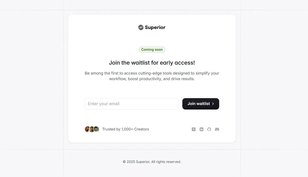
Ultra-clean, centered layout focused entirely on value proposition and waitlist signup with zero distractions. Green "Coming soon" badge creates anticipation. Action-oriented headline: "Join the waitlist for early access!" High-contrast dark CTA button with arrow. Trust signal: "Trusted by 1,000+ Creators" with avatar proof. Social media icons for community building.
What works: Generous whitespace keeps absolute focus on the form. The benefit-rich subheadline (simplify workflow, boost productivity) speaks directly to pain points.
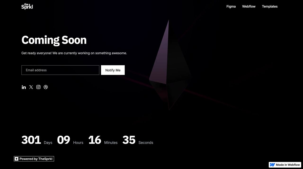
Example 3: Bold Split-Screen Design
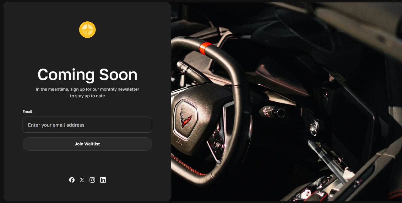
Premium dark-themed page with striking split layout pairing bold copy with high-impact product photography. Split-screen: content on left, compelling product image on right. Large, bold "Coming Soon" headline impossible to miss. Newsletter framing keeps expectations clear. Professional product photography creates desire and curiosity.
What works: Dark theme creates a premium, modern aesthetic perfect for design-conscious audiences.
Best Use Cases:
- Design tools and creative software
- Products where design is a key differentiator
- Brands targeting design-conscious audiences
- Interactive prototypes needing motion
Framer enables sophisticated animations without code, perfect for products where the design itself is part of the value proposition. Your coming soon page can demonstrate the quality of work customers will receive.
See complete Framer setup guide →
Building with Squarespace
Squarespace is ideal for lifestyle brands, creative professionals, and businesses where aesthetics matter significantly.
Example 1: Community Launch Page
Warm, inviting design perfect for community-focused launches. Large hero image with overlay text creates emotional connection. Clear value proposition with benefit-focused copy. Email capture integrated seamlessly into the design.
What works: The warm aesthetic immediately communicates brand personality. Perfect for wellness, lifestyle, or community-driven products.
Example 2: Fashion E-commerce Launch
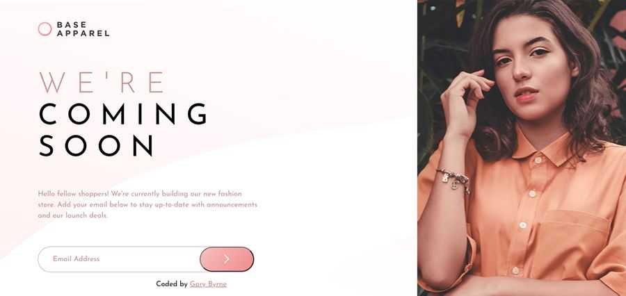
High-fashion aesthetic with stunning photography. Minimal text lets the imagery speak. Bold typography creates premium positioning. Newsletter signup integrated elegantly.
What works: For fashion and luxury brands, the photography IS the message. This approach lets products sell themselves visually.
Example 3: Portfolio Website Launch
Professional, creative portfolio teaser. Bold typography with striking background image. Clean, simple form doesn't compete with the design. Social links for multi-platform presence.
What works: Shows the quality of creative work visitors can expect. The design itself becomes a portfolio piece.
Best Use Cases:
- Fashion and apparel launches
- Luxury goods and premium products
- Lifestyle brands and influencer products
- Photography and creative services
Large, high-quality hero images with overlay text work beautifully. The platform's templates are inherently visual-first, perfect for products where imagery sells. Built-in form builders integrate with email platforms, making lead capture seamless. The mobile experience is consistently strong across templates.
See complete Squarespace guide →
Building with Webflow
Webflow offers maximum design control without requiring coding expertise, perfect for brands needing custom designs.
Example 1: Professional SaaS Launch
Modern, professional design with clear hierarchy. Clean layout with ample whitespace. Product preview showing actual interface. Strong CTA with benefit-focused button text. Trust indicators and social proof integrated naturally.
What works: Professional without being corporate. The interface preview builds confidence in the product quality.
Example 2: Visual-First Product Reveal
Bold, visual-heavy design that leads with product imagery. Large hero image creates immediate interest. Minimal copy lets the visuals do the talking. Clear value proposition above the fold. Prominent email capture with high-contrast CTA.
What works: For products where showing beats telling, this approach captures attention instantly.
Example 3: Agency-Grade Launch Page
Sophisticated design showcasing advanced layout capabilities. Custom animations and interactions. Pixel-perfect typography and spacing. Multi-section layout with smooth scrolling. Professional photography integrated throughout.
What works: Demonstrates what's possible with Webflow's design tools. Perfect for brands that need to communicate quality through design.
Best Use Cases:
- Tech startups needing pixel-perfect designs
- Brands with specific design systems
- Products requiring custom animations
- Teams with design resources but no developers
Complete control over every design element enables perfect brand consistency. The CMS functionality allows easy updates without touching code. Webflow's animation tools enable sophisticated interactions that build engagement. You can create experiences that feel custom-built at a fraction of developer costs.
See complete Webflow setup guide →
Building with WordPress
WordPress dominates the web for good reason—flexibility, plugins, and endless customization options.
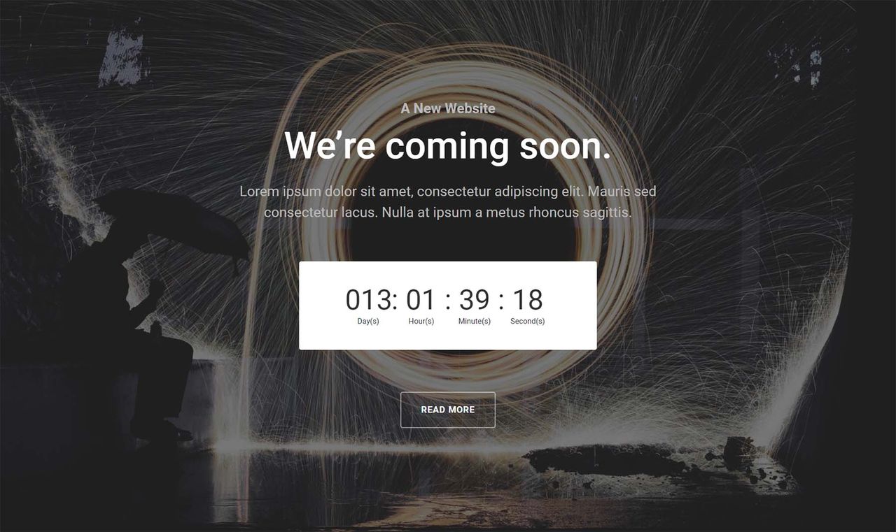
Example 1: Minimalist Website Launch
Clean, focused design with minimal distractions. Centered layout keeps attention on the message. Simple color palette (often monochrome or two-color). Clear headline with supporting subtext. Single email input with prominent submit button. Countdown timer creating urgency.
What works: Simplicity reduces friction. Nothing competes with the signup form for attention.
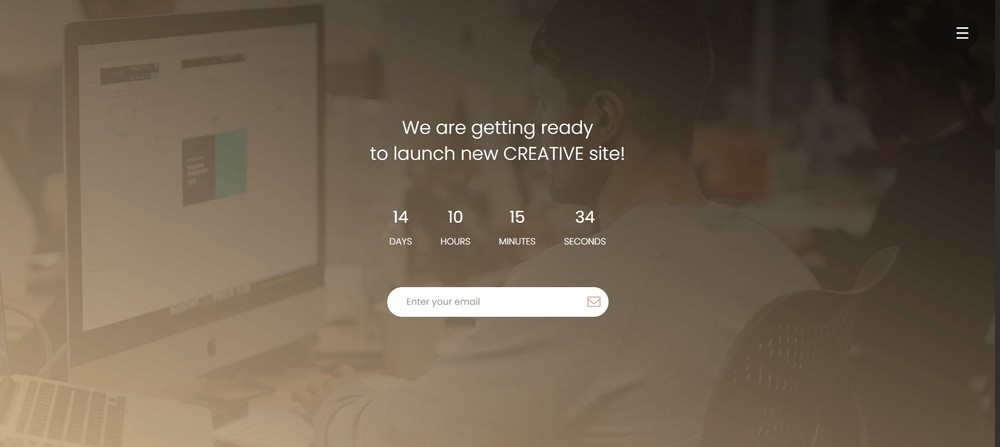
Example 2: Visual-First Website Launch
Stunning full-screen background image or video. Bold typography overlaid on imagery. Transparent or semi-transparent form. Social media icons integrated naturally. Progress bar or countdown timer. Mobile-optimized responsive design.
What works: High-quality visuals create emotional connection. Perfect for lifestyle, travel, or creative brands.
Example 3: Professional Website Launch
Corporate-friendly design with trust indicators. Logo prominently displayed. Multiple sections explaining value proposition. Countdown timer with specific launch date. Email capture with privacy policy link. Social proof elements (testimonials, client logos). Footer with contact information.
What works: Professional appearance builds credibility. Multiple trust signals reduce signup hesitation.
Best Use Cases:
- Existing WordPress site owners
- Blogs adding product launches
- Content-heavy products needing SEO
- Businesses requiring extensive customization
Plugins like SeedProd, Coming Soon, and Maintenance Mode enable sophisticated pages without development. These tools include countdown timers, email capture, social integration, and customizable templates. WordPress's SEO capabilities mean your coming soon page can start ranking before launch, building organic traffic to your email list.
See complete WordPress guide →
Design Elements That Drive Conversions
Beyond full page examples, let's examine specific design choices that consistently boost conversion rates.
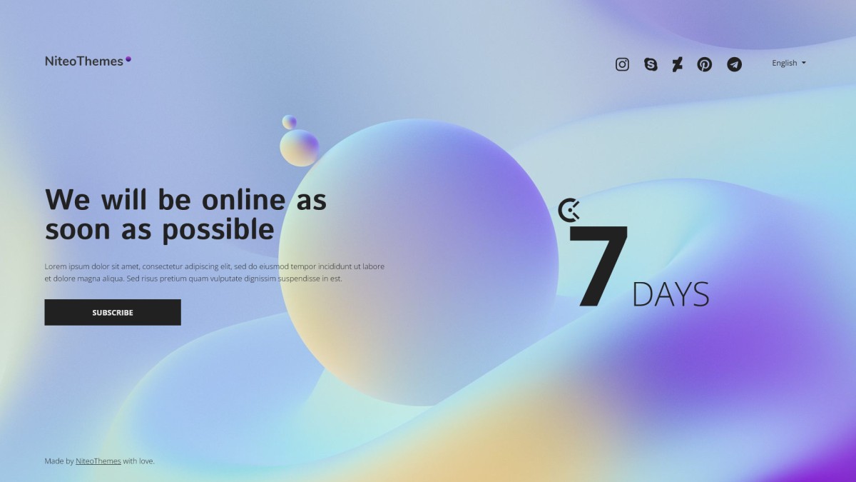
Countdown Timers: When They Work and When They Don't
Countdown timers build anticipation and provide clear timelines, but they must be accurate. A false countdown destroys credibility and creates a unprofessional image.
Use countdown timers when:
- You have a definite launch date
- You're doing a limited-time offer or drop
- You're launching in phases (beta, then full launch)
- You have a specific event (conference, announcement, etc.)
Skip countdown timers when:
- Your timeline is uncertain
- You're in early development
- You're waiting for funding or partnerships
- Your launch depends on external factors
Email Capture Form Design
The simpler, the better. Research shows that form optimization is critical to maximizing signups. Most effective forms include just an email field and a compelling submit button.
High-converting form elements:
- Single email field only
- Large, prominent submit button
- Benefit-focused button text ("Get Early Access" vs "Submit")
- Privacy reassurance ("We'll never spam you")
- Visual hierarchy that guides eye to form
Conversion killers:
- Multiple required fields
- Unclear privacy policies
- Generic button text
- Forms that blend into background
- Asking for phone numbers (unless essential)
Background Choices
Your background sets the entire mood of your page.
Static images work for: Premium brands, lifestyle products, anything where photography quality matters
Video backgrounds work for: Tech products, modern brands, anything needing motion and energy
Gradient/solid colors work for: SaaS products, minimalist brands, anything where copy is the star
Particle/animation effects work for: Creative tools, gaming, anything targeting design-conscious users
Social Proof Integration
Showing subscriber counts, testimonials, or company logos builds trust and leverages social proof.
Effective social proof elements:
- Real-time signup counters ("Join 10,247 others waiting")
- Beta user testimonials
- Logos of companies in your beta
- Social media follower counts
- Press mentions or awards
When to skip social proof:
- You have fewer than 100 signups (low numbers hurt more than help)
- You have no testimonials yet
- You're targeting early adopters who prefer being first
Common Mistakes That Kill Conversions
Even with great examples to follow, most coming soon pages fail. Here's why.
The "Clever" Headline Problem
Your headline is critical - research shows well-crafted headlines can triple conversion rates. However, creativity at the expense of clarity destroys conversion. "We're reimagining the paradigm of digital transformation" means nothing. "Project management that actually works" is clear and compelling.
Test your headline with someone who knows nothing about your product. If they can't explain what you do after reading it, rewrite.
The Feature Dump Trap
Listing every feature you plan to build overwhelms visitors and distracts from the core value proposition. Save the feature list for your full website.
Your coming soon page should answer one question: "Why should I care?" Features are how you deliver value, not the value itself.
The Invisible CTA Mistake
Making your email signup form hard to find or blend into the background costs you signups. The form should be immediately visible without scrolling.
Use contrasting colors for your CTA button. If your page is mostly white, make the button a bold color that pops. If your background is dark, make the button bright.
The Trust Vacuum
Visitors need to trust you enough to provide their email addresses. Without credibility indicators, they assume you might be a scam.
Add trust signals: privacy policy link, legitimate business address, social media links with real followers, founder photos, beta user testimonials.
The Communication Ghost Problem
Between sign-up and launch, you have a golden opportunity to build relationships and keep the hype train going. Too many founders capture emails then go silent for months.
Build a pre-launch email sequence before you launch the coming soon page. Send updates every 1-2 weeks: development progress, behind-the-scenes content, feature reveals, beta invitations.
Advanced Tactics: Taking It to the Next Level
Once you've nailed the basics, these advanced strategies can multiply your results.
The Referral Engine Upgrade
Basic email capture is fine. Referral-powered email capture is exponentially better.
Dropbox's "give free space, get free space" model was a game-changer, with both the referrer and their friend receiving extra storage, encouraging signups and fueling rapid growth. According to case studies, double-sided reward structures are significantly more effective than one-sided incentives.
Implement tiered rewards: first referral gets them something small, five referrals unlock something better, ten referrals get them premium access or significant discounts.
Show progress visually. When people can see their referral count grow or their position on the waitlist improve, it creates a sense of accomplishment.
The Exclusive Access Tier
Not all early access is created equal. Create multiple access tiers:
Tier 1 - Free Beta: Anyone who signs up gets beta access when ready Tier 2 - Early Access: First 1,000 signups get access two weeks before public launch Tier 3 - VIP Access: Top 100 referrers get immediate access plus lifetime discount
Tiered access creates friendly competition and gives people clear goals to work toward.
The Content Teaser Strategy
Don't just collect emails and disappear. Give people reasons to stay engaged:
- Behind-the-scenes development updates
- Founder story and mission
- Problem-solution educational content
- Sneak peeks of features or products
- Interactive polls about what to build next
Each piece of content reminds subscribers why they signed up and maintains excitement until launch.
The Milestone Celebration Approach
Celebrate milestones publicly and reward early supporters:
"We just hit 1,000 signups! To celebrate, everyone who referred at least 3 people gets a bonus perk."
"10,000 people on the waitlist! Moving our launch date up by two weeks."
Milestones create news, give you content to share on social media, and reward the community for their support.
Frequently Asked Questions
How do I create a coming soon page?
Pick a builder, write a headline that says what you're launching and who it's for, add a single email field, and connect it to a waitlist so you can email signups at launch. You can build one in an afternoon with a dedicated tool like Waitlister or start from a template.
How do I add a coming soon page on Shopify?
Use a coming-soon or password page to gate your store, then add an email-capture form so visitors join your launch list. Our Shopify coming soon page guide walks through the setup with real examples.
How do I add a coming soon page on WordPress?
Install a coming-soon plugin like SeedProd, pick a template, add your headline and an email form, then activate it — visitors see the page while you keep building behind it. See our WordPress coming soon page guide.
How do I add a coming soon page on Squarespace?
Enable a cover page under Settings → Site Availability and choose a "Coming Soon" style, then add a Newsletter Block to capture emails. Our Squarespace coming soon page guide shows the full setup.
How do I add a coming soon page on Wix?
In the Wix Editor, add a landing page with no header or footer, set it as your homepage, and add a subscribe form — keep the rest of the site unpublished until launch. See our Wix coming soon page guide.
How do I add a coming soon page on GoDaddy?
In GoDaddy Websites + Marketing, build a single page with a headline and a Subscribe section, then publish the "Coming soon" page before your full site is ready. See our GoDaddy coming soon page guide.
What should a coming soon page include?
At minimum: a headline that says what's launching and who it's for, one email field, and a clear submit button. Add social proof (a signup count or a testimonial), a real launch date only if you have one, and a referral incentive to encourage sharing. Keep it all above the fold.
Do coming soon pages help with SEO?
Yes. A coming soon page can start ranking and earning links before launch, so you arrive on day one with existing authority and an email list. Publish it on your real domain (not a temporary subdomain), give it a clear title and description, and keep the URL stable through launch.
Ready to Build Your High-Converting Coming Soon Page?
Waitlister includes everything you need to create a coming soon page that actually converts.
✅ Professional templates optimized for conversion
✅ Built-in referral programs for viral growth
✅ Email automation and analytics
✅ No coding required
Plus, it's free to start. No credit card required.